Understanding Line Plots: Examples and Applications

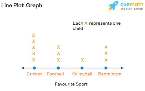
A line plot, also known as a line graph or line chart, is a type of graphical representation that displays information as a series of data points connected by line segments. It is commonly used to show trends over time, especially when there are many data points. Below are five examples that illustrate the versatility and utility of line plots in various contexts.
Example 1: Stock Market Trends
In finance, line plots are crucial for tracking stock prices over time. For instance, a line plot can be used to display the daily closing prices of a particular stock over the course of a year. This helps investors and analysts identify patterns, such as peaks, troughs, and trends, which can inform investment decisions. A line plot showing a consistent upward trend might indicate a strong and growing company, while a downward trend could signal financial difficulties.
Example 2: Temperature Fluctuations
Environmental science often employs line plots to illustrate temperature changes. A researcher studying climate change might use a line plot to show the average global temperatures over the past century. This visual representation can highlight gradual increases or decreases in temperature, seasonal variations, and anomalies. By analyzing these trends, scientists can better understand the impacts of climate change and develop more accurate models for future temperature predictions.
Example 3: Sales Performance Over Time
In business, line plots are valuable for monitoring sales performance. A company might use a line plot to track its monthly sales figures over the course of a year. This helps in identifying periods of high and low sales, which can be crucial for strategic planning, such as inventory management and marketing campaigns. For example, if sales consistently peak in December due to holiday shopping, the company can prepare by increasing production and staffing levels during that time.
Example 4: Student Progress in Education
Educators often use line plots to chart a student’s academic progress over time. By plotting test scores, assignment grades, or other performance metrics, teachers can visually assess how well a student is understanding the material and identify areas where the student may need extra support. This can be particularly useful for tracking the effectiveness of educational interventions or modifications to the teaching approach.
Example 5: Heart Rate Monitoring in Healthcare
In healthcare, line plots can be used to monitor a patient’s heart rate over time, providing valuable insights into cardiovascular health. During exercise or recovery, healthcare professionals can use line plots to track how a patient’s heart rate responds to different conditions. This information is crucial for diagnosing heart conditions, determining the effectiveness of treatments, and planning appropriate exercise regimens for patients with heart-related issues.
Key Points
- Line plots are effective for displaying trends over time, making them useful in finance for tracking stock prices and in environmental science for monitoring temperature changes.
- In business, line plots help in analyzing sales performance and planning accordingly, such as managing inventory levels and scheduling marketing campaigns.
- Educators use line plots to track student progress, identifying strengths, weaknesses, and the effectiveness of educational strategies.
- In healthcare, line plots are instrumental in monitoring heart rate and other vital signs, aiding in diagnosis, treatment planning, and patient care.
- The ability to visualize data over time makes line plots an indispensable tool for pattern recognition, forecasting, and decision-making across different disciplines.
| Application Area | Description of Use |
|---|---|
| Finance | Tracking stock prices and identifying market trends. |
| Environmental Science | Monitoring temperature changes and analyzing climate patterns. |
| Business | Analyzing sales performance and planning strategic marketing initiatives. |
| Education | Tracking student progress and assessing the effectiveness of educational interventions. |
| Healthcare | Monitoring heart rate and other vital signs to inform patient care and treatment plans. |

What are the primary advantages of using line plots for data analysis?
+Line plots offer several advantages, including the ability to clearly display trends over time, facilitate the identification of patterns and anomalies, and provide a straightforward visual representation that can be easily understood by both professionals and laypersons.
How can line plots be used in strategic planning and decision-making?
+By analyzing trends and patterns in line plots, individuals can forecast future trends, identify areas of improvement, and make informed decisions. For example, a business might use a line plot of sales data to plan inventory and marketing strategies, while an investor might use a line plot of stock prices to decide when to buy or sell.
What are some common challenges or limitations of using line plots for data analysis?
+While line plots are powerful tools for data analysis, they can be limited by the complexity of the data being represented. For instance, if there are too many data points or if the data varies significantly, the plot may become cluttered or difficult to interpret. Additionally, line plots may not be the best choice for displaying categorical data or data without a natural order.


