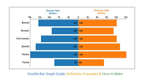
A double bar graph is a type of graphical representation that displays two sets of data side by side, allowing for easy comparison between the two datasets. This type of graph is particularly useful when you want to visualize the differences or similarities between two groups, categories, or time periods. In this guide, we will delve into the world of double bar graphs, exploring their structure, applications, and best practices for creation and interpretation.
Key Points
- Understanding the basic structure of a double bar graph, including axes, bars, and labels.
- Learning how to create a double bar graph, including choosing the right data, selecting appropriate scales, and designing the graph for clarity.
- Interpreting double bar graphs, including comparing datasets, identifying trends, and drawing conclusions.
- Exploring common applications of double bar graphs in real-world scenarios, such as business, education, and research.
- Best practices for effective communication using double bar graphs, including avoiding clutter, using appropriate colors, and ensuring accessibility.
Understanding Double Bar Graphs

A double bar graph consists of two axes: the x-axis (horizontal) and the y-axis (vertical). The x-axis typically represents the categories or groups being compared, while the y-axis represents the scale or magnitude of the data. Each category on the x-axis has two bars, one for each dataset, allowing for direct comparison between the two. The bars can be of different lengths, indicating different values, and can be oriented either horizontally or vertically, although vertical orientation is more common.
Components of a Double Bar Graph
The components of a double bar graph include:
- Bars: These are the graphical representations of the data. Each bar corresponds to a specific category and dataset.
- Axes: The x-axis and y-axis provide the framework for the graph, allowing the data to be plotted and measured.
- Labels: These are the titles or descriptions given to the axes and the bars, helping to explain what the graph represents.
- Legend: If the graph includes multiple datasets or categories, a legend can help distinguish between them by providing a key to the colors or patterns used.
Creating a Double Bar Graph

Creating a double bar graph involves several steps, from selecting the appropriate data to designing the graph for maximum clarity and effectiveness. Here are some key considerations:
Choosing the Right Data
The first step in creating a double bar graph is to select the data you want to compare. This data should be quantitative and categorical, allowing for easy comparison between the two datasets. Ensure that the data is accurate, relevant, and appropriately scaled for comparison.
Designing the Graph
When designing the graph, consider the scale of the y-axis carefully. The scale should be appropriate for the data, allowing for easy comparison without exaggerating or minimizing differences. Also, consider the use of colors and patterns for the bars. These should be chosen to maximize contrast and clarity, making it easy to distinguish between the two datasets.
| Design Element | Best Practice |
|---|---|
| Colors | Use contrasting colors to distinguish between datasets. |
| Patterns | Avoid using patterns if possible; they can make the graph harder to read. |
| Scales | Ensure the scale is appropriate for the data and consistent between graphs if comparing multiple graphs. |

Interpreting Double Bar Graphs
Interpreting a double bar graph involves comparing the lengths of the bars to understand the relationships and differences between the two datasets. Here are some tips for effective interpretation:
Comparing Datasets
Look for similarities and differences in the bar lengths. Are there categories where one dataset significantly outpaces the other? Are there any categories where the datasets are nearly equal?
Identifying Trends
Examine the graph for trends. Are there patterns of increase or decrease across the categories for one or both datasets? Are these trends consistent or do they vary significantly?
Drawing Conclusions
Based on your observations, draw conclusions about the data. What insights do the comparisons offer? What implications might these have for decision-making, research, or further investigation?
Applications of Double Bar Graphs
Double bar graphs have a wide range of applications across various fields, including business, education, and research. They are particularly useful for:
Business Applications
In business, double bar graphs can be used to compare sales figures between different regions, products, or time periods. They can help in identifying trends, making forecasts, and informing strategic decisions.
Educational Applications
In education, double bar graphs can be used to compare student performance across different subjects, schools, or teaching methods. They can help educators identify areas of strength and weakness, informing curriculum development and teaching strategies.
Research Applications
In research, double bar graphs can be used to compare experimental and control groups, different treatments, or outcomes over time. They are useful for visualizing complex data in a clear and concise manner, facilitating the communication of research findings.
Best Practices for Effective Communication

For a double bar graph to be effective, it must communicate information clearly and efficiently. Here are some best practices to keep in mind:
Avoiding Clutter
Keep the graph simple and uncluttered. Avoid including too much information, as this can confuse the viewer and obscure the main points of comparison.
Using Appropriate Colors
Choose colors that are easy to distinguish from one another and suitable for the audience. Consider colorblindness and ensure that the colors used are accessible to all viewers.
Ensuring Accessibility
Make sure the graph is accessible to all potential viewers. This includes using clear labels, providing a legend if necessary, and ensuring that the graph can be easily understood by those with visual impairments.
What is the primary purpose of a double bar graph?
+The primary purpose of a double bar graph is to compare two sets of data side by side, allowing for the visualization of differences and similarities between the datasets.
How do you choose the right scale for a double bar graph?
+Choosing the right scale involves ensuring that the scale is appropriate for the data, allowing for easy comparison without exaggerating or minimizing differences. The scale should be consistent and relevant to the context of the data.
What are some common applications of double bar graphs?
+Double bar graphs have applications in business, education, and research, among other fields. They are useful for comparing sales figures, student performance, experimental outcomes, and more, facilitating decision-making, strategic planning, and the communication of complex data.
In conclusion, double bar graphs are a powerful tool for comparing two sets of data, offering insights into trends, differences, and similarities. By understanding how to create, interpret, and apply double bar graphs effectively, individuals across various disciplines can enhance their ability to communicate complex information, inform decision-making, and drive strategic actions based on data-driven insights.